Your Compose Text Is Quietly Lying About Its Weight
How Compose resolves FontWeight, why SemiBold silently renders as Bold, and the typography failures that surface in production.
Typography rarely shows up in a sprint review. Nobody files a ticket that says “the type system is elegant.” But the day a designer opens your build and says “that heading isn’t the weight I specified,” you discover how much of your UI’s personality lives in a handful of font files and one resolution algorithm you never read.
This post walks through how Jetpack Compose maps a FontFamily to the weights you request, centralizes that mapping so a typeface swap is a one-file change, and the production failure modes that bite teams after the happy path works. The examples use Manrope as the typeface, but nothing here is specific to it.
From the View system to Compose
In the View system, custom typography meant fontFamily attributes in XML, <font-family> resources, TextAppearance styles, and a Typeface you sometimes patched in code. Overriding one piece often meant touching several layers.
Compose collapses this into plain Kotlin values. A font family is an object, a text style is an object, and both compose like any other value. That makes typography testable, diffable in code review, and replaceable in one place.
Declare the family once
import androidx.compose.ui.text.font.Font
import androidx.compose.ui.text.font.FontFamily
import androidx.compose.ui.text.font.FontWeight

val Manrope = FontFamily(
    Font(R.font.manrope_regular, FontWeight.Normal),
    Font(R.font.manrope_medium, FontWeight.Medium),
    Font(R.font.manrope_bold, FontWeight.Bold),
)
Each Font entry binds a file to the weight it represents. The family is just a lookup table from (weight, style) to a file.
Declare it as a top-level val in your design-system module. Font resources are loaded when text first needs them, not at declaration, so a top-level family is cheap and safe to share.
Wire it into the theme, not into call sites
The most common mistake in migrated codebases is passing fontFamily = Manrope to individual Text calls. It works, and it quietly recreates the scattered-attribute problem you were trying to escape.
Put the family into a Typography and let the theme distribute it:
import androidx.compose.material3.Typography
import androidx.compose.ui.text.TextStyle
import androidx.compose.ui.unit.sp

val AppTypography = Typography(
    titleLarge = TextStyle(
        fontFamily = Manrope,
        fontWeight = FontWeight.Bold,
        fontSize = 22.sp,
        lineHeight = 28.sp,
    ),
    titleMedium = TextStyle(
        fontFamily = Manrope,
        fontWeight = FontWeight.Medium,
        fontSize = 16.sp,
        lineHeight = 24.sp,
    ),
    bodyLarge = TextStyle(
        fontFamily = Manrope,
        fontWeight = FontWeight.Normal,
        fontSize = 16.sp,
        lineHeight = 24.sp,
    ),
)

@Composable
fun AppTheme(content: @Composable () -> Unit) {
    MaterialTheme(typography = AppTypography, content = content)
}
Call sites then express intent, not appearance:
Text(
    text = "Order confirmed",
    style = MaterialTheme.typography.titleLarge,
)
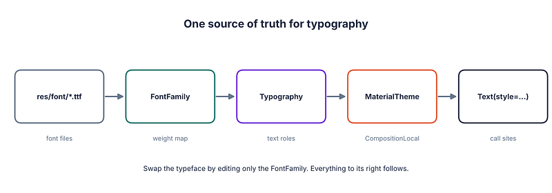
When design changes the brand typeface, you replace the FontFamily and rebuild. Every style that references it follows, because weights are resolved through the family rather than hard-coded per file.
How weight resolution actually works
When Text requests a weight, Compose asks the family for the best match. If an exact (weight, style) entry exists, you get that file. This is the part most posts stop at, and it is also the easy part.
The interesting behavior is what happens when the exact weight is not declared. Compose does not throw and does not log a warning. It picks the nearest available face using a CSS-like matching rule. As a rough summary:
- Requested weights below 400 prefer the next lighter face, then fall back to heavier ones.
- Requested weights above 500 prefer the next heavier face, then fall back to lighter ones.
- Requested weights between 400 and 500 look in that narrow band first, then lighter, then heavier.
Apply that to our family, which declares 400, 500 and 700:
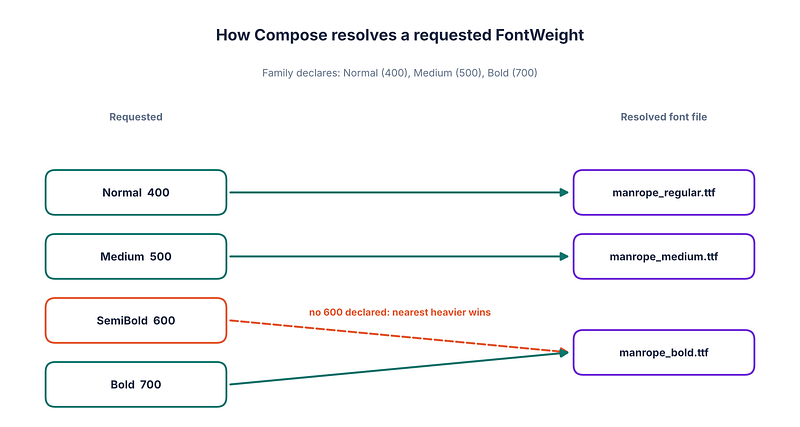
A design spec that says “SemiBold” renders as Bold. Nothing crashes. The screen just looks slightly louder than the mock, and the discrepancy survives until a designer compares pixels.
Make the fallback visible
Silent fallbacks are best caught by rendering every weight in one place. A weight ladder preview takes a few lines and belongs in your design-system module:
@Preview(showBackground = true)
@Composable
private fun WeightLadderPreview() {
    AppTheme {
        Column(Modifier.padding(16.dp)) {
            listOf(
                FontWeight.Light, FontWeight.Normal, FontWeight.Medium,
                FontWeight.SemiBold, FontWeight.Bold, FontWeight.ExtraBold,
            ).forEach { weight ->
                Text(
                    text = "Weight ${weight.weight}: Quick brown fox",
                    fontFamily = Manrope,
                    fontWeight = weight,
                )
            }
        }
    }
}
If two adjacent rows look identical, you have found a missing face. Promote this to a screenshot test (Paparazzi or Roborazzi both work) so a font swap that drops a weight fails CI instead of shipping.
Fixing the SemiBold gap
You have two honest options.
Ship the file. Add manrope_semibold.ttf and declare it:
val Manrope = FontFamily(
    Font(R.font.manrope_regular, FontWeight.Normal),
    Font(R.font.manrope_medium, FontWeight.Medium),
    Font(R.font.manrope_semibold, FontWeight.SemiBold),
    Font(R.font.manrope_bold, FontWeight.Bold),
)
Use a variable font. One file, many weights, with each entry selecting a point on the weight axis:
@OptIn(ExperimentalTextApi::class)
val ManropeVariable = FontFamily(
    listOf(400, 500, 600, 700).map { w ->
        Font(
            resId = R.font.manrope_variable,
            weight = FontWeight(w),
            variationSettings = FontVariation.Settings(
                FontVariation.weight(w),
            ),
        )
    }
)
Variable fonts shrink APK size when you need many weights, but they come with a platform constraint covered below. Check whether your Compose version still requires the opt-in annotation.
Failure modes worth knowing before production
1. Faux italics
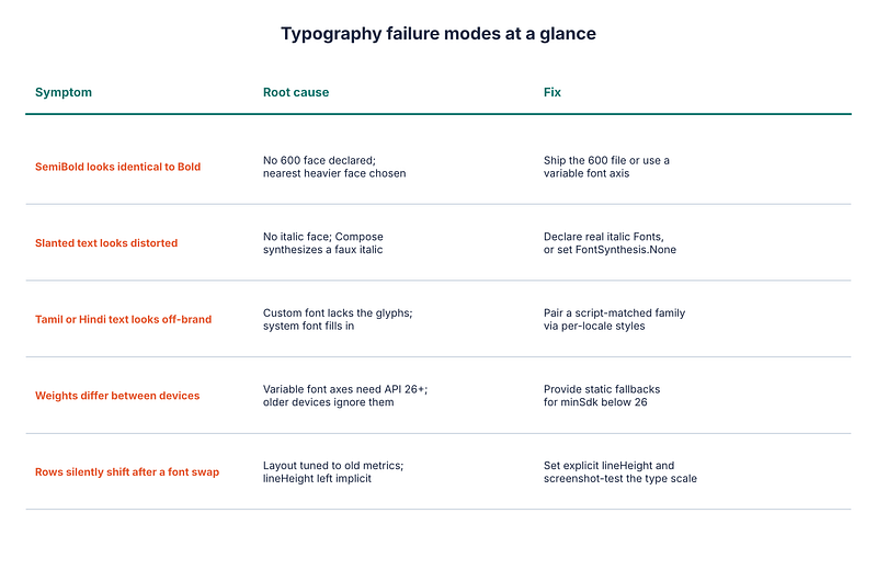
If you request FontStyle.Italic and the family declares no italic face, Compose synthesizes a slanted version of the upright glyphs. The result is mechanically skewed text that type designers wince at, and it can look noticeably worse for fonts with distinctive italic letterforms.
Declare real italic files with style = FontStyle.Italic, or turn synthesis off and accept upright text:
Text(
    text = "Edge case",
    fontStyle = FontStyle.Italic,
    fontSynthesis = FontSynthesis.None,
)
The same synthesis applies to bold. Asking for a bold weight from a family that has none can produce smeared pseudo-bold. Prefer real files.
2. Missing glyphs and mixed scripts
A Latin-focused brand font often has no Tamil, Devanagari, Arabic or CJK glyphs. For text in those scripts, the platform substitutes a system font glyph by glyph. The result is a screen where Latin characters look branded and everything else looks like system UI, with baseline and line-height mismatches that make rows jitter.
If your app ships in multiple languages, test the long-tail scripts explicitly. Pair a script-appropriate family per locale and select it from the theme, rather than hoping the substitute looks acceptable.
3. Variable fonts on older devices
Variable font axes are applied through platform support that starts at API 26. On older devices the variation settings are ignored, so every entry in the family above renders at the font’s default weight. If your minSdk is below 26, declare static fallbacks, or branch on Build.VERSION.SDK_INT when building the family.
val Manrope = if (Build.VERSION.SDK_INT >= Build.VERSION_CODES.O) {
    ManropeVariable
} else {
    ManropeStatic
}
4. Metrics change when the typeface changes
Swapping typefaces changes ascent, descent and average glyph width. Layouts that relied on implicit line height will reflow, and tightly constrained containers (chips, tab labels, buttons) can start truncating. Set explicit lineHeight in every style, as in the Typography above, and snapshot-test your longest realistic strings.
5. Weight set during styling collides with weight set at call sites
TextStyle merges with parameters passed to Text. A stray fontWeight = FontWeight.Bold at a call site overrides whatever the theme specified, so a later theme change appears to "not work" on that one screen. Treat explicit typography arguments on Text as a code smell and prefer style = MaterialTheme.typography.x, adjusting with .copy(...) only when truly necessary.
Why one definition pays off
Because the family is the single place that knows which file serves which weight, replacing the brand typeface becomes a contained change:
- Add the new font files under
res/font. - Rewrite the
FontFamilydeclaration to point at them. - Run the weight ladder screenshot test and review the diff.
Nothing else in the codebase names a font file. That is the real payoff of Compose’s mapping model: not saving keystrokes, but making an app-wide design change reviewable in one diff.
A short checklist
- Declare one
FontFamilyper typeface in your design-system module. - Reference it from
Typography, and have call sites use theme styles. - Declare every weight and style your design actually uses, including SemiBold and italics.
- Add a weight ladder preview and a screenshot test.
- Check non-Latin scripts if you localize.
- Provide static fallbacks if
minSdkis below 26 and you use variable fonts.
Typography is infrastructure. Treat it with the same care as networking or navigation and it stops being the thing you debug on release day.
Further reading
🍎 Share Your Kotlin Code with iOS — Without Rewriting Your App
If “we’ll just build it twice, once per platform” describes how your team ships mobile, I’d recommend “Kotlin Multiplatform for Android Developers” — a 22-chapter, hands-on guide that goes past the sample-project demos and follows the shared module all the way to two app store submissions. No iOS or Swift background required.
It walks through the expect/actual mechanism and source set hierarchy, shared architecture, networking with Ktor, persistence with Room KMP and SQLDelight, Koin dependency injection, Flow and StateFlow with Swift interop (SKIE and Swift Export), Compose Multiplatform versus native SwiftUI, navigation, testing across two runtimes, dual-toolchain CI/CD with Linux and macOS runners, publishing a KMP library, and migrating an existing Android app module by module. Everything builds toward one capstone: an offline-first Expense/Budget Tracker, complete with a pending-sync queue, retry/backoff, and a deployment checklist for both stores.
- E-book: Available on Google Play
- Kindle Edition: Available on Amazon
- Topmate: Available on Topmate
- Also available in Paperback & Hardcover.
About the author
- Android Engineer & Kotlin Advocate. 🚀 Deep dives into Jetpack Compose, Coroutines, and Clean Architecture. Turning complex code into scalable solutions. 🛠️✨
Comments
Join the discussionNo comments yet. Be the first to comment.